Redefining Cooking Through Smart Simplicity.
Advieh reimagines what a recipe app can be—shifting from static instructions to a responsive, intelligent platform that learns from real user behavior. By combining AI-powered personalization, contextual time management, and an intuitive interface, it removes friction from the cooking process and adapts to how people actually cook. The result is more than a recipe tool—it’s a smarter, more human way to plan, cook, and connect with food.
MY ROLE
UX/UI Designer
Co-Founder
UX strategy
End-to-end design
TOOLS
Figma
FigJam
Adobe Illustration
Confluence
Jira
Miro
TEAM
1 Designer
1 Developer
DURATION
5 Months
“Usability testing with 20 participants showed that Advieh reduced task time by 24% and navigation steps by 30%, helping users stay focused and complete recipes more efficiently.”
THE CONTEXT
The Broken Promise of Recipe Apps
Cooking should be a creative, satisfying experience—whether it takes 15 minutes or three hours. But many recipe apps fall short of that promise. Designed to simplify the process, they often do the opposite: introducing friction through misleading prep times, vague instructions, and scattered interfaces.
Instead of supporting the flow of cooking, these tools disrupt it—forcing users to pause, backtrack, and second-guess what should be simple steps. The result is frustration, confusion, and a loss of confidence in the kitchen. What should feel natural becomes fragmented.
This disconnect between user expectations and actual experience exposes a critical gap—one that demands a smarter, more adaptive solution built around clarity, flow, and ease for cooks at every level.
Sophia
"I picked this recipe because it said 30 minutes,
but halfway through, it suddenly told me to marinate for 3 hours! I had no dinner, no plan B, and felt completely stuck."
1 y ago .
Misleading Info

IDENTIFYING THE CORE PROBLEMS
Why Cooking Feels Harder Than It Should
Cooking is meant to be intuitive, creative, and even therapeutic. But for many users, digital tools have added complexity instead of clarity.
Our analysis of popular recipe apps, combined with user behavior insights, revealed a consistent pattern: the problem isn’t with cooking—it’s with how apps structure the experience.
Most platforms are built around rigid, linear workflows that ignore the realities of how people cook. From vague instructions to overwhelming interfaces, they create friction at every step. Instead of adapting to the user's flow, they expect users to adapt to the app—resulting in stress, errors, and a loss of confidence.
These patterns became clear across four recurring friction points we observed during our analysis:
Poor Visual Design
Most apps present cooking content with no clear structure or hierarchy. Dense formatting and poor layout make it hard to understand
Overwhelming Interfaces
Crowded screens and inconsistent organization increase cognitive load. Users struggle to focus, especially while actively cooking.
Rigid Interaction Flows
Many apps follow a one-size-fits-all approach. They don’t support different skill levels, dietary needs, or kitchen setups when flexibility is needed.
Lack of Beginner Support
Apps often skip essential guidance for new cooks. Without tips, visuals, or simplified steps, learning feels frustrating and unsupported.
PROBLEM STATEMENT
Root of the Problem
Most recipe apps lack the visual clarity and flexibility users need while cooking. Poor layout, overwhelming interfaces, and rigid user flows disrupt the experience—making it difficult for home cooks to stay focused, confident, and in control throughout the process.
RESEARCH
Understanding the Gaps in Real-World Cooking
Our goal was to shape a product that meets real needs, fits the market, and solves the right problems from day one. To do that, we needed to go beyond assumptions and truly understand how people cook, where they face obstacles, and what kind of support they expect from digital tools in real kitchen scenarios.
This phase centered on understanding where friction happens, how needs vary, and what users expect from tools that genuinely support them.
Foundational Research
This phase was key to shaping Advieh’s direction, not by validating assumptions, but by uncovering real moments of friction, hesitation, and unmet needs in the kitchen. The aim was to go beyond surface insights and understand where today’s recipe apps fail—and what users truly need from a tool built to support them, not just instruct them.We focused on uncovering:
-
What frustrates users in current recipe app experiences
-
Where friction occurs during real-time meal preparation
-
How cooking habits, dietary needs, and confidence levels vary
-
What users expect from a reliable, supportive cooking companion
To capture these insights, I used a combination of behavioral and attitudinal research methods to build a clear, actionable picture of the everyday cooking experience.
Home Kitchen Observations
I observed a diverse group of home cooks—ranging from beginners to experienced enthusiasts—preparing real meals in their own kitchens. The goal was to understand not just what they did, but how they felt in the process: how they moved between steps, interacted with digital tools or physical notes, and made decisions in the moment. These contextual sessions revealed friction that often goes unnoticed in lab-based testing: interruptions caused by needing to scroll with messy hands, switching between apps to check timers or clarify terms, and losing track of handwritten or saved recipes. I paid close attention to how these challenges impacted their focus, confidence, and overall enjoyment—highlighting gaps that modern recipe platforms often overlook.
User Survey
The survey explored a wide range of friction points users experience while interacting with digital recipe tools, specifically around recipe navigation, unclear or missing time breakdowns, trust in instructions, and feature preferences. With over 90 participants across varying skill levels and dietary needs, the goal was to move beyond general satisfaction ratings and uncover the subtleties that shape user confidence and decision-making.
Responses revealed common frustrations: steps that felt too vague, prep times that didn’t match reality, and a lack of context around dietary tags or difficulty levels. It also highlighted user desires for features that go beyond instruction, such as in-app timers, ability to personalize steps, and confidence-boosting community feedback.
68%
of users want to improve their cooking skills
45%
of users cook at home to eat healthier
About 43%
are frustrated by unclear steps
58%
of the users follow at least one dietary restriction
INTERVIEWS
Validating Our Assumptions
Interviews with over 20 participants, paired with survey responses, uncovered a consistent pattern: users often lose momentum mid-recipe due to vague language, missing context, and lack of real-time support.
Many began with excitement, only to stall when they encountered friction—poor interface cues, unfamiliar culinary terms, or steps that left them unsure if they were on the right track. Several shared they had to pause and search for meanings of phrases like “fold in” or “soft peaks,” breaking their flow and confidence.
These findings reinforced a critical insight: even brief moments of uncertainty can disrupt user trust and flow—leading to frustration, hesitation, or complete abandonment of the recipe experience.

Mark
"Some apps assume I know a lot—I just want to start cooking, and I’m new to it."

Jenna
"I had to keep unlocking my phone with messy hands—super annoying."

Luis
“I couldn’t tell how hard the recipe was, it didn’t mention the level anywhere.”

Aisha
"My daughter has restrictions, so I always have to check the recipe first."
Understanding user behavior
Beyond individual feature requests, our interviews revealed deeper behavioral and emotional gaps in the current recipe app experience. Users weren’t just struggling with unclear steps—they were losing confidence, breaking flow, and disengaging from the task altogether.Participants described moments where the interface didn’t respond to their pace or needs—whether it was pausing to verify an ingredient, navigating away to decode a term, or managing physical constraints like messy hands while unlocking a device. These weren’t isolated incidents; they were repeated patterns that exposed a disconnect between digital tools and the realities of real-life cooking.
We also heard frustration around personalization—particularly from users with dietary restrictions, who found it exhausting to decode which recipes applied to them. Others lacked upfront context about difficulty or time commitment, leading to mismatched expectations and mid-recipe friction.
Collectively, these insights pointed to a core opportunity: to design not just for usability, but for continuity, trust, and support. The goal wasn’t to add more features—it was to remove doubt, reduce friction, and ensure the app worked with users, not against them.
PERSONA
Defining Our Audience
I chose two distinct user types to gain deeper insights into varied cooking needs: one representing a busy individual with limited cooking experience, eager to explore new and diverse recipes, and the other a more experienced cook with specific dietary restrictions, seeking to refine their culinary skills.
These profiles reflect the unique goals, challenges, and preferences of users at different stages of their cooking journey, helping us design solutions that cater to diverse lifestyles and create a more tailored and effective cooking experience.

Layla, 36
"If I can’t trust the recipe to be gluten-free, it’s not worth the risk."
Family-focused home cook managing a gluten allergy
Goals
-
Prepare safe, gluten-free meals the whole family can enjoy together
-
Save time during busy evenings without sacrificing quality or flavor
-
Rely on recipes that feel credible, tested, and easy to follow
Needs
-
Clear, trustworthy instructions to avoid ingredient mistakes
-
Gluten-free, family-friendly options that don’t feel limiting
-
Smooth in-app navigation with minimal back-and-forth during prep
Pain Points
-
Inconsistent or missing dietary filters for gluten-free options
-
Vague step-by-step instructions that cause uncertainty
-
Frustration toggling between steps and ingredients while cooking

Jake, 24
"I’m not a chef—just give me a recipe that’s clear and easy to follow, or I’ll skip it."
Busy tech professional and beginner home cook
Goals
-
Learn to cook simple meals without stress or confusion
-
Save time with quick, well-structured recipes suited to a busy schedule
-
Build confidence in the kitchen through clear visual guidance
Needs
-
Step-by-step instructions with visuals to stay on track
-
Short, jargon-free language that’s easy to understand
-
Smart timers or cues to manage multiple tasks smoothly
Pain Points
-
Loses focus in long, text-heavy recipes
-
Gets confused by unclear or overly technical steps
-
Finds it hard to coordinate prep and cooking times
COMPETITIVE ANALYSIS
How are the rest of them doing it?
To understand where Advieh could meaningfully stand apart, I conducted a competitive analysis of leading recipe platforms including Tasty, Yummly, Epicurious, Pick Up Limes, and several others. The goal was to uncover usability gaps that disrupt the cooking experience and identify opportunities for improvement, not in content volume or branding, but in how these apps support users through real-time cooking tasks.


The analysis revealed several recurring weaknesses across popular recipe apps, both in interface design and core functionality:
FINAL OUTCOME
What Advieh Simplified and Improved?
While most recipe apps focus on offering volume, they often fall short on usability. Users are left navigating cluttered layouts, vague instructions, and inconsistent time breakdowns.
With Advieh, we focused on simplifying the experience, removing friction, building trust, and making every screen intentional. From organizing ingredients and clarifying steps to surfacing dietary tags and prep tips, every decision was grounded in real user feedback.
Our goal wasn’t to create an idealized cooking experience—it was to support real cooks in real kitchens. That meant designing for focus, flexibility, and clarity at every stage of the journey.
The following comparisons highlight how Advieh improves the cooking experience by simplifying it, focusing on what truly matters and doing it really well, instead of adding more features.
Connected cooks. Confident outcomes.

Community & Connectivity
People want more than ratings—they want connection, clarity, and confidence. Instead of limiting feedback to stars and a short review, we built a space for real interaction. Users can leave tips, ask questions, react instantly, upload photos of their results, and share recipes with others. This turns each recipe into a living exchange, encouraging trust, inspiration, and a stronger sense of community in the kitchen.
Advieh changes this by transforming feedback into collaboration. Users can leave tips, ask questions, react instantly, upload photos of their results, and share recipes with others. Each recipe becomes an active space for interaction—encouraging trust, inspiration, and a stronger sense of community in the kitchen.


Tap. Time. Taste. Done.
Because every minute matters.
.jpeg)
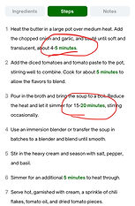
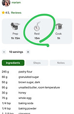
Timing Made Clear
Clear time breakdowns help users cook with confidence. When every stage of timing is visible and easy to follow, it sets realistic expectations and supports better planning throughout the process. Users know exactly how long to prepare, cook, and rest each component, which reduces uncertainty and prevents frustration mid-recipe. By presenting time information in a structured, consistent way, Advieh helps users stay organized, focused, and in control from start to finish.
Clear timing enhances trust and makes the cooking process feel smooth, predictable, and stress-free.


Distraction-Free Timing
Setting a timer shouldn’t mean losing your place or breaking concentration. Yet for many home cooks, switching between apps interrupts the flow and adds stress to an otherwise enjoyable process.
Timing matters—especially for home cooks managing busy schedules. Advieh introduces a built-in, step-linked timer that keeps everything in one place—helping users stay focused, organized, and confident from start to finish.


.png)
.png)
.png)
One Recipe, All the Support.
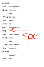
Personal Notes
How many scattered notes, papers, or saved pages do you have for your recipes?
Users often jot down tips or tweaks while cooking, but switching apps or relying on memory breaks focus. Advieh’s built-in notes keep thoughts and reminders in one place—making cooking seamless and personal.
.jpeg)
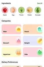
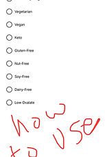
Diet Tags
When dietary needs are visibly and consistently labeled, users can quickly assess what works for them—enhancing clarity, saving time, and making every recipe feel more accessible. Without clear dietary tags, users risk choosing recipes that conflict with their restrictions, potentially leading to health concerns or a loss of trust in the app.

DESIGN
Advieh Walkthrough


RETROSPECTIVE
Designing with Empathy, Not Just Features
This project marked a defining moment in my growth as a designer. It showed me that crafting a product isn't just about implementing features, it’s about shaping experiences that reduce friction, build clarity, and earn trust.
The real challenge wasn’t just solving usability issues, but doing so in a way that felt intentional and human. Every design decision, from layout hierarchy to interaction flow—was guided by empathy and real user insight. Through testing, iteration, and reflection, I learned how to make each screen feel calm, focused, and purposeful.
This experience deepened my understanding of how to design for more than functionality. It taught me how to design for clarity, momentum, and meaningful engagement.
Here are a couple of the most important takeaways:
Designing for Focus
Less wasn’t just more—it was necessary. Stripping away distractions and guiding users through a clear, intentional flow became a core principle in every decision I made.
Letting Feedback Lead
Real users challenged assumptions and reshaped priorities. Their voices were the foundation of every meaningful improvement.
RELEASE ON APPSTORE
Officially Live
After months of focused research, thoughtful design, and continuous iteration, Advieh is now officially live—reviewed, approved, and available on the App Store.
We set out to design more than just an app—we wanted to build a cooking experience that feels intuitive, supportive, and enjoyable for every user. From screen structure to recipe flow, every decision was shaped by real user needs and tested in real-world kitchens.
This release isn’t the finish line—it’s the beginning. What’s live today reflects everything we aimed to solve, but it’s just the first step. Your feedback continues to guide us, and improvement remains our priority. We’re committed to keeping Advieh updated, relevant, and always evolving to serve real cooks better.


WHAT'S NEXT
Elevating the Cooking Experience with AI
Advieh is designed to grow alongside its users. Future iterations will integrate AI to simplify decision-making, personalize the cooking journey, and intelligently adapt to user behavior. From smart recipe suggestions and timing optimizations to adaptive content delivery, AI will help remove friction and surface what matters—when it matters.
Looking ahead, Advieh will also open its platform to emerging culinary voices, enabling talented creators to contribute content and build a knowledge-sharing ecosystem. As user needs evolve, the app will continue to respond—adding new features and experiences shaped directly by real engagement and feedback.
Advieh isn’t just a recipe app—it’s a cooking companion designed to grow itself and help every user grow.
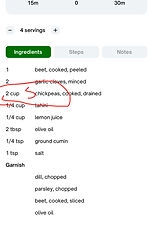
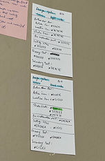
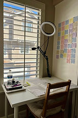
BEHIND THE SCENES
Our Real Work Shots, Iterations, and Design Moments